The Problem:
Mean and standard deviation don’t tell you very much about where to focus an improvement effort.
The Solution:
Histograms and run charts clarify analysis and lead to better questions.
henever you need to explain a continuous dataset, a picture is worth a thousand words. Histograms and run charts are the pictures that will serve you best. A histogram is the shape of your data and the run chart is the direction of your data.
Think for a moment about the audience of your LSS work. If you asked them to explain what a mean represents, what would they say? First they’d say it’s the average. Most could explain the math, but if you asked them to go deeper, to explain what the mean means, what would they say?
Some use the mean as a demarcation between above average and below average, a boundary between two foggy zones of goodness and badness. Others equate the mean with “normal” and quickly proceed to apply arbitrary limits neatly separating the data into normal and abnormal zones. Both of these instincts pose risks to your message and your improvement effort.
Standard deviation has the same problem. How many people know what standard deviation represents? Or what to do with it? Not very many. My suspicion is that no one will ever ask you to explain standard deviation. For non-normal distributions (any data is not bell-shaped), standard deviation is essentially useless in and of itself. (The simplest way to determine if your data is normal is to build a histogram.)
The LSS facilitator can build a narrative around a histogram and a run chart to move the audience away from their reliance on means and avoid the problematic standard deviation.
An example:
Let’s say you’re on a project that’s tackling “excessive wait time” at a fictional patient service desk. After some data gathering and scrubbing, you find:
- mean of 16.8 minutes
- standard deviation of 20.5 minutes
What decisions can you make about the direction of the project with this information? You might get lucky but you’d still be working in the dark, knowing little about your variation.
How a histogram leads to better questions
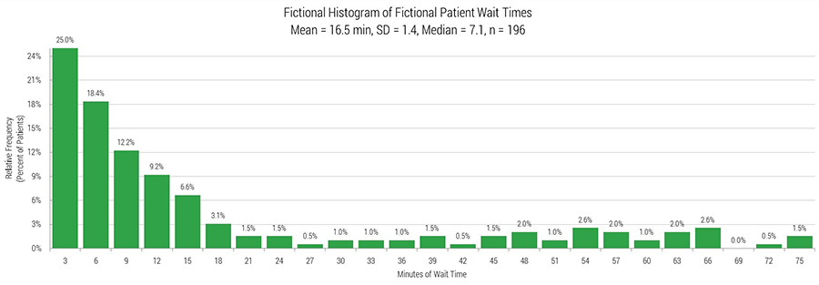
Looking at this histogram, a LSS facilitator might say:
- You can see that 25% of the sample waited 3 minutes or less.
- 76% of the sample waited 21 minutes or less, meaning 24% waited longer than 21 minutes.
- There’s a long tail, pulling the mean to the right.
The mean doesn’t tell us that a quarter of the population is waiting 21 minutes or more.
The better question: “Since 24% of our population waited longer than 21 minutes, what if our next step is focusing on the causes of waits greater than 20 minutes?”
How a run chart leads to better questions
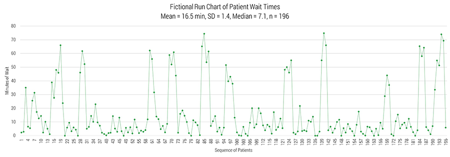
Looking at this run chart, a LSS facilitator might say:
- “Most of the data points are below 20 minutes."
- "When the data goes up, it seems to stay up in little groups of 3 to 5 patients."
The mean obscures this pattern.
The better question: “Why does this happen? It looks like it happens every 7-20 patients. Let’s schedule a gemba walk focused on this pattern.”
Another example, with the same mean and standard deviation, but different distribution.
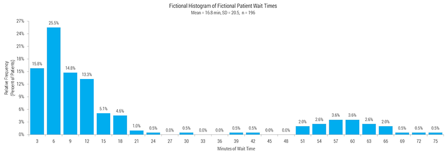
The histogram shows we really have two populations mixed on one graph, but in friendlier layperson terms a LSS facilitator might say, “We have two things going on here. We should look at a run chart.”
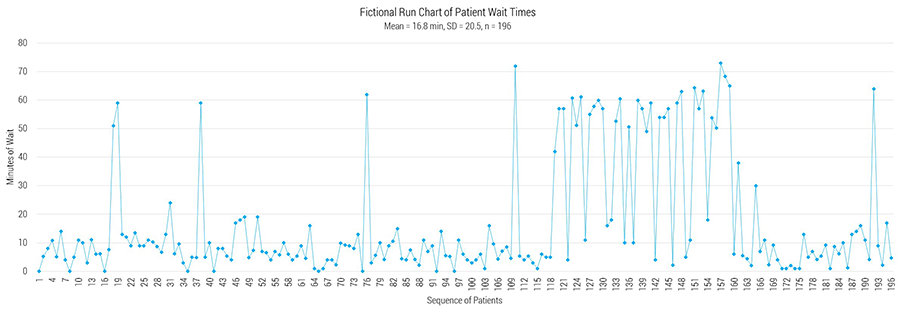
The team could get into the percentages (69.4% of the sample waited 12 minutes or less) or they could jump to the run chart and see that there was a singularly terrible period (patients 119-165). Seeing this, the domain experts on the team could likely identify what happened. If it was a blue moon event, the project could be gated. If it was a rare but recurring event, the team would immediately know where to focus the project.
Of course we can’t just ignore the mean; we need it to calculate financial impact and conduct two sample t-tests. But the deceptive duo of mean and standard deviation are put in plain perspective with the honest histogram and reliable run chart; they contain more information and communicate it with greater clarity.
